Preparing better graphs
“In scientific publications, your skill in displaying data—how well you design tables and graphs—is as important as your skill in writing.”—Tom Lang (1)
Introduction
Graphs have been used to report scientific data for centuries. William Playfair, credited as the founder of statistical graphs, developed line, area, and bar charts in 1786 and pie charts and circle graphs in 1801 (2). As Playfair said in 1801, to give insight to statistical information, “‘it occurred to me, that making an appeal’ to the eye when proportion and magnitude are concerned, is the best and readiest method of conveying a distinct idea.” (2). Indeed, Playfair’s idea of appealing to the eye has, over time, led scientific manuscripts to increase their reliance on graphs. Today, “The graph now has to be considered the premier form for scientific visual representation.” (3).
Two examples illustrate the potential impact of effective graphs. Florence Nightingale, a nurse who cared for British troops during the Crimean War (1853–1856), famously created coxcomb pie charts (sometimes called polar area charts), which showed that far more soldiers died of disease than of war wounds. These charts made the point so well that they stimulated what became a complete restructuring of the War Department (4). In another example, in 1986, the space shuttle Challenger blew up when an O-ring failed during a launch at low temperatures. A graph of the performance data of O-rings had been arranged by the date of the launch rather than by the critical factor, the temperature during the launch, which did not highlight the fact that O-rings were likely to fail at launches below 66 °F. Whether a different graph would have prevented the launch is debated, but clearly the lack of relevant information was a factor in the decision to continue with the launch (5).
A major problem with graphs in scientific journals is that they are created automatically with spreadsheets and statistical analysis programs. Such graphs are often better for analyzing data than they are for communicating them. As a result, however, implementing the advice in this article can be difficult because it requires learning how to adjust the settings on the program. Given the importance of reporting data effectively, it is worth your time to learn how to do so.
Graph components
Most graphs in scientific publications contain the following components: a figure number, a figure caption, axis scales and labels, the data field, the data, and sometimes a headnote and one or more footnotes, callouts, and a legend (Figure 1).
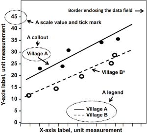
Figure number
Each figure should be numbered sequentially in the text with Arabic numerals. If only one figure is used, the figure should not include a number (e.g., “Figure” not “Figure 1”).
Figure caption
Whereas tables have titles, figures have captions. Like tables, however, captions identify the data being presented. Captions should not identify the type of graph (e.g., “A line graph showing…”) because such information is obvious. Below are some ineffective captions and suggested revisions.
- Ineffective: Bar graph detailing the time to occurrence of progression to high-grade dysplasia in the ablation and control groups of patients with Barrett’s esophagus, by number of follow-up days;
- Revision: Time to progression to high-grade dysplasia in patients with Barrett’s esophagus, by study group.
- Ineffective: Cumulative lung cancer mortality for smokers 40, 50, 60, 70, and 80 years old from Eastern Europe, by former, current, and never smoking status;
- Revision: Cumulative lung cancer mortality for Eastern European smokers 40 years and older, by smoking status.
Headnotes
Headnotes follow the figure caption and provide more detail or other qualifying information about the figure. Abbreviations in the figure can also be spelled out in a headnote or in a separate note immediately below the data field.
Axis scales and labels
The horizontal (X-axis) and vertical (Y-axis) axes require scales and labels that identify the variables being graphed and the units of measure. Conventionally, vertical axes indicate outcome variables (also called dependent or response variables), and horizontal axes indicate exposure variables (also called independent or explanatory variables). On vertical axes, numbers should increase from bottom to top; on horizontal axes, they should increase from left to right.
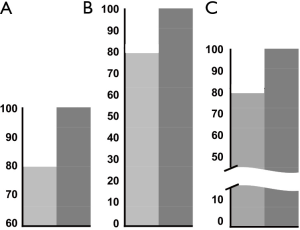
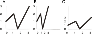
Whenever possible, start the vertical axis at zero. Although a scale with a baseline other than zero is common and useful, such a scale can visually distort relationships among the data. In such cases, breaking both the scale and the data field can emphasize the nonzero baseline (Figure 2). Scale divisions should be labeled with tick marks at major, logical, and usually equal intervals. Scale units should be reported to the appropriate degree of precision. In addition, be aware of the “elastic-scale” problem, in which the ratio of the height of the graph to its width (the aspect ratio) can visually change the relationships in the graph (Figure 3).
Data
The data in a graph usually consist of individual data points or lines that summarize a set of points. Different sets of data points are best graphed with contrasting symbols, such as open and closed symbols (●○,▲△, or □■), rather than different shapes (●, ■, and ▲), which are harder to tell apart. When graphing lines, use patterns that are as different as possible.
Data field
The data field is the rectangular space that contains the data. It is bordered on two sides by the horizontal and vertical scales. Enclosing the data field with a line along all four sides helps readers read values accurately and avoids data in the upper-right region from “floating” off the graph. The data field should primarily contain the data, but it sometimes contains error bars, confidence intervals (CIs), callouts, a legend or key, or other graphic devices. Explain all symbols, line styles, colors, and shading used in the figure with labels or callouts in the data field or in a headnote if the data field is too crowded. Also, define any error bars (which indicate various types of uncertainty or variation), such as standard deviations, ranges, interquartile ranges, or CIs.
Footnotes
Footnotes in the data field are called out with superscript symbols (e.g., *, †, ‡, §, ¶) or with superscript lowercase letters (e.g., a, b, c) in the figure. Footnotes appear after the caption or headnote and provide specific details about the footnoted item.
- Caption: Differences in estimated mean health expenditures;
- Headnote: Differences are shown for those who did and did not receive Supplemental Nutrition Assistance Program (SNAP) benefits;
- Footnotes: aTwo patients were missing in this group; bNone of the patients in this group had hypertension.
Callouts
Callouts label individual data points, groups, or special features of a graph. Labeling the feature directly with a callout is preferred to putting the identifying information in a legend, although many statistical and spreadsheet programs automatically provide legends.
Legends or keys
A legend or key is a list of symbols, sometimes set off in a box in the data field, that appear in the figure with their names or explanations (Figure 1). Whenever possible, use direct labeling, rather than a legend, because a callout is clearer and makes the information more accessible to the reader.
General considerations in preparing graphs
After the proper graph type is selected, several design elements should be considered, such as black and white vs. color, line thickness, callouts or legends, and dimensions. Design elements can greatly influence the clarity of the data being reported. Unnecessary or confusing visual effects [what Tufte calls “chartjunk” (6)], such as overuse of colors and labels, superfluous grid lines, or background patterns, can hinder the reader’s ability to interpret the data. Simpler is almost always better (7).
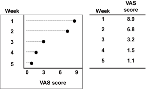
The amount of data to be displayed should be large enough to justify graphing it. Small data sets are often best presented in the text or a table. In addition, if you want to communicate overall patterns or differences in the data, graphs are more appropriate than tables. If you want to communicate exact values or differences, tables are more appropriate than graphs (Figure 4). You should also consider the difference between presentation graphs and publication graphs. Whereas graphs used in presentations (e.g., PowerPoint projections and posters) should communicate information in a quickly digestible way (Figure 5), graphs used in publications can provide increasingly complex data (Figure 6).
The size of the graph should be based on the instructions for authors. Most journal pages are 1 to 4 columns wide; therefore, publishers often specify that graphs be in multiples of the column width. Graphs that are too wide or too narrow will most likely be returned to you for resizing. Elements in the graph, such as lines, symbols, and labels, should be legible and not distracting if the graph has to be reduced to fit on the page.
The cost associated with color printing often prohibits print journals from publishing color graphs. Therefore, most graphs will be printed in black and white. However, if a graph is conveying a lot of information and the use of shades or patterns makes the data difficult to decipher, color may be necessary. As publishing moves more online, the use of color is becoming more feasible. However, color should still be used only when it enhances the reader’s ability to interpret the data; using color just to use color, too much color, and poor color choice can reduce readability (8).
Graph selection
Selecting the most suitable type of graph is critical to effectively displaying data. The type of graph depends on the nature of the data being reported (a concept called “level of measurement”) and the message you want to convey.
Data are often divided into two major levels of measurement: qualitative and quantitative. Categorical or qualitative data are data that can be separated into groups, such as race, sex, or blood type. Categorical data can be subdivided into nominal and ordinal levels of measurement. Nominal data have two or more categories that do not have an intrinsic order [e.g., blood types (A, B, AB, or O) or sex (male or female)]. Ordinal data have three or more categories that have an inherent ranking (e.g., mild, moderate, or severe disease). In contrast, the other major level of measurement is continuous or quantitative data, which are counts or measurements on a scale of equal intervals, such as time, volume, or size, and which, when graphed, form a distribution (e.g., length in centimeters).
Reporting categorical data
Dot charts
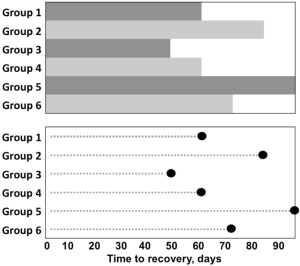
Whereas bar charts indicate values by extending the bar to the desired position on the scale, a dot chart displays nominal or ordinal quantities on a single-scaled axis by indicating the value with a dot, which focuses attention on the data and not on a bar (Figure 7). Dot graphs can also effectively present summary data, such as means, medians, odds ratios, hazard ratios, risk ratios, or relative risks. In dot graphs, a single value may be accompanied by error bars that indicate the variation around the value (e.g., standard deviations, interquartile ranges, or 95% CIs and sometimes standard errors).
Reporting continuous data
Box or box-and-whisker plots
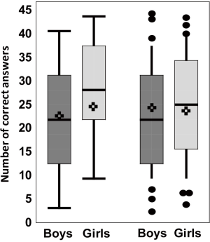
A box or box-and-whisker plot summarizes distributions of continuous data (Figure 8). Typically, a box plot contains rectangular boxes (representing interquartile ranges, the values at the first and third quartiles, or the 25th and 75th percentiles), a horizontal line (representing the median or 50th percentile), and lines or “whiskers” above the rectangular box [representing the maximum (upper whisker) and minimum (lower whisker) values]. The mean is often given as an asterisk. If the whiskers are extended from the 10th to the 90th percentiles, individual values beyond these percentiles can be plotted to help identify outliers (outliers are values so different from the rest of the data that they may be unrelated to the rest of the data).
Line graphs
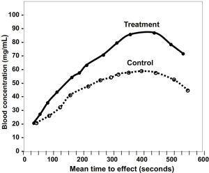
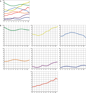
A line graph consists of a series of related data points connected with a line, with or without symbols (Figures 1,9). Data lines should be thicker than the axis lines to draw attention to the data. When graphing several data lines, especially when the lines overlap, consider graphing each line separately in what are called “small multiples” (Figure 10). The data lines can still be compared but without the confusion of too many lines.
Scatterplots
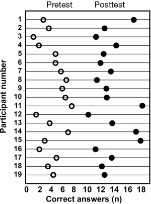
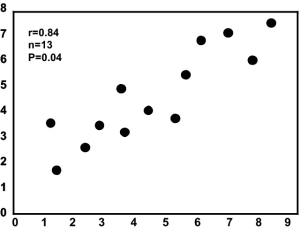
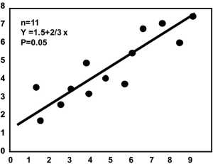
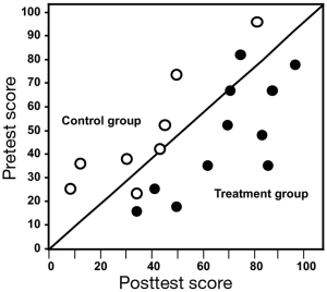
A scatterplot displays data for two continuous variables and is often associated with correlation analyses (Figure 11). Data points are not connected by or summarized with lines. When used with correlation analysis, the number of data points (the sample size), the correlation coefficient, and a 95% CI or a P value are generally given in the data field (Figure 12). A line fit to the data to summarize the relationship among the data points usually means that the analysis has gone beyond correlation to simple linear regression. When used for this purpose, the number of data points (the sample size) and the regression equation are generally given in the data field. Finally, the scatterplot can also be used to present pretest and posttest values taken from the individual (Figure 13).
Trellis charts
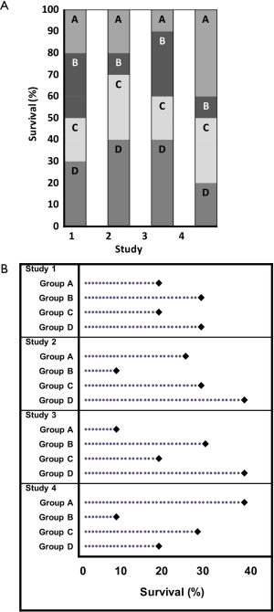
Trellis charts extend dot charts to graph more than one variable. In this respect, they are similar to the small multiples in Figure 10. They are more effective than divided bar or column charts, for example, because they compare values from a common baseline (Figure 14).
Specialized graphs used in public health research
Flow charts
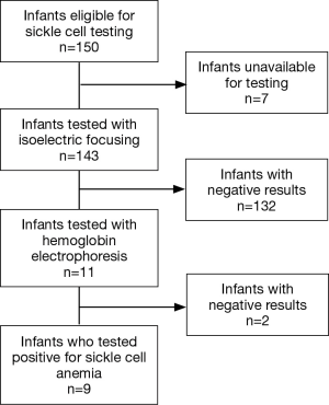
Although not a true graph, a flow chart presents data that are useful in documenting the sample selection process or the flow of participants through a study and can help account for all participants (Figure 15). Such charts are required in many reporting guidelines, such as the CONSORT statement for reporting randomized trials and the STROBE statement for reporting observational studies.
Time-to-event (or Kaplan-Meier) curves
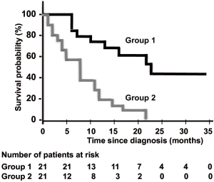
A time-to-event (or Kaplan-Meier) curve displays the time to an event, such as the time between surgery and death or between the end of treatment and recovery (Figure 16). It is important to provide the number of individuals at risk in each study group at key times in a table below the horizontal axis so readers know how many were included in the analysis at each time (9).
Forest plots
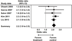
A forest plot shows the individual and pooled results of meta-analyses, which summarize the results of two or more studies addressing the same research question (Figure 17), although they can be used in other types of studies as well, such as reporting subgroup analyses. Forest plots usually indicate the strength of treatment effects. They usually contain a list of studies, a corresponding measure of effect, such as odds ratios or relative risks and the associated 95% CIs, often the sample size of each study, and the plot of these data. Data markers can reflect the size or weighting of the study in the analysis. “Favors” headings (e.g., favors treatment, favors placebo) and a dotted line at 1 (meaning that the risk or odds in one group is the same as that in the other) should be used. A diamond usually represents the overall or pooled result. The CIs are usually shown as horizontal bars. Bars crossing the line of unity (1 in risk and odds ratios) indicate that the difference between groups is not statistically significant at the 0.05 level.
Graphs with limited uses in scientific publications
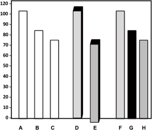
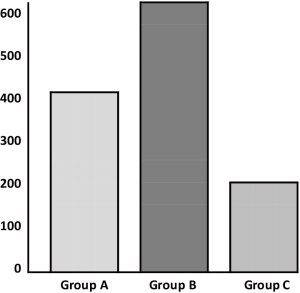
Bar or column charts, divided bar or column charts, 3-dimensional graphs, and pie charts have limited application in reporting scientific data. Common problems with bar or column charts, in addition to that shown in Figure 7, include not differentiating the columns from the background, adding an unnecessary and confusing third dimension, and making one column stand out with a very light or a very dark fill (Figure 18). Similarly, 3-dimensional graphs should not be used to graph 2-dimensional data because they are difficult to read and can distort the relationships in the data (Figure 19). The third dimension seldom contains useful information.

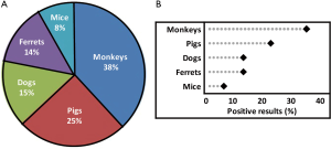
Pie charts are poor visual communicators of data because they require comparing angles and areas, which we do not do well (Figure 20). As Edward Tufte, American statistician and data visualization expert, states, “A table is nearly always better than a dumb pie chart; the only worse design than a pie chart is several of them, for then the viewer is asked to compare quantities located in spatial disarray both within and between charts … Given their low density and failure to order numbers along a visual dimension, pie charts should never be used.” (6) Although more general publications have retained the use of pie charts, these charts should be used rarely, if at all, in scientific publications.
The most common problems with graphs
- The misleading data problem (e.g., vertical scale is miss-sized, data are not drawn to scale, scale skips numbers or does not start with zero, graph is mislabeled, data are omitted, tick marks are misspaced or missing);
- The poor design problem (e.g., bar graph, histogram, or pie chart is used; data would be better serviced in the text or a table; graph either wastes space or is too crowded; symbols, colors, shading, or patterns are not defined; superfluous color, shading, or patterns are used; figure components create an optical distortion problem; graph is not comprehensible on its own and reader needs to refer to the text to understand the graph);
- The hidden message problem [i.e., graphs should display the author’s main point in an immediate and accessible way; sometimes poorly defined ideas, ineffective figure aesthetics, or murky data can get in the way of the graph’s message. As Rougier et al. state, “If your figure is able to convey a striking message at first glance, chances are increased that your article will draw more attention from the community.” (10)].
Summary
Graphs are the most effective means of visually summarizing and highlighting a study’s findings. Graphs provide readers with the ability to quickly digest the results of a study or to see overall patterns quickly. The choice of graph type depends to some extent on whether you are graphing nominal, ordinal, or continuous data, how many variables you want to graph, how much data you want to graph, and how much variability the data have. In addition, graphs should be as simple and clear as possible and should not use unnecessary elements. A graph, with its caption, should be able to stand on its own without requiring undue reference to the text. The best graphs are those that clearly present data and indicate why the data are important.
Acknowledgments
I thank Tom Lang for reviewing early drafts of this article and for rendering many of the figures.
Funding: None.
Footnote
Provenance and Peer Review: This article was commissioned by the the Guest Editor (Thomas A. Lang) for the series “Publication and Public Health” published in Journal of Public Health and Emergency. The article has undergone external peer review.
Conflicts of Interest: The author has completed the ICMJE uniform disclosure form (available at http://dx.doi.org/10.21037/jphe.2017.12.03). The series “Precision Infectious Disease Epidemiology” was commissioned by the editorial office without any funding or sponsorship. The author has no other conflicts of interest to declare.
Ethical Statement: The author is accountable for all aspects of the work in ensuring that questions related to the accuracy or integrity of any part of the work are appropriately investigated and resolved.
Open Access Statement: This is an Open Access article distributed in accordance with the Creative Commons Attribution-NonCommercial-NoDerivs 4.0 International License (CC BY-NC-ND 4.0), which permits the non-commercial replication and distribution of the article with the strict proviso that no changes or edits are made and the original work is properly cited (including links to both the formal publication through the relevant DOI and the license). See: https://creativecommons.org/licenses/by-nc-nd/4.0/.
References
- Lang TA. How to Write, Publish, and Present in the Health Sciences: A Guide for Clinicians & Laboratory Researchers. 1st edition. Philadelphia, PA: ACP Press, 2010.
- Playfair W. The Statistical Breviary: Shewing, on a Principle Entirely New, the Resources of Every State and Kingdom in Europe. Oxford: Oxford University Press, 1801.
- Harmon JE, Gross AG. The Scientific Article: From Galileo's New Science to the Human Genome. Available online:http://fathom.lib.uchicago.edu/2/21701730/
- Biography.com. Florence Nightingale. Available online: https://www.biography.com/people/florence-nightingale-9423539. Accessed December 4, 2017.
- Tufte ER. Visual Explanations: Images and Quantities, Evidence and Narrative. 1st edition. Cheshire, CT: Graphics Press, 1997.
- Tufte ER. Visual Display of Quantitative Information. 2nd ed. Chesire, CT: Graphics Press, 2001.
- Wainer H. How to display data badly. Am Stat 1984;38:137-47.
- Meaux S. Using color in scientific figures. American Journal Experts. Available online: http://www.aje.com/
- Rich JT, Neely JG, Paniello RC, et al. A practical guide to understanding Kaplan-Meier curves. Otolaryngol Head Neck Surg 2010;143:331-6. [Crossref] [PubMed]
- Rougier NP, Droettboom M, Bourne PE. Ten simple rules for better figures. PLoS Comput Biol 2014;10:e1003833. [Crossref] [PubMed]
Cite this article as: King L. Preparing better graphs. J Public Health Emerg 2018;2:1.

